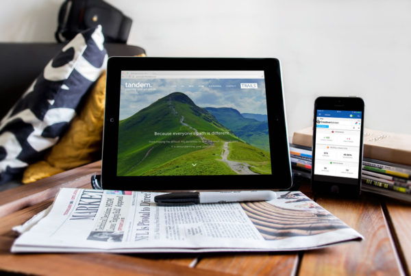
Are you a financial planner or adviser considering a new website design project? If so, great! However, you may be wondering which essential features you should include in your project. After all, this is not an insignificant investment of time and money, so it’s a good idea to have a clear checklist in mind before commencing your project. Should you be putting effort into a bespoke client portal, for instance, or including a fancy set of pension calculators?
In this short guide, our website design team here at CreativeAdviser will be sharing 10 features to consider including on your upcoming project. Make sure you discuss these with your agency beforehand, however, as every project is different. We hope you find this content helpful, and we invite you to arrange a free consultation if you’d like to discuss your financial web design project with us.
Here are 10 idea, in no particular order:
#1 Social links
Most consumers now expect businesses to be active on social media platforms. If you have a dormant LinkedIn or Facebook account, for instance, then it might be worth re-igniting it and then connecting the links to these profiles on your new website design. Not only does this help to drive traffic between your digital assets, but it helps to boost brand credibility and makes you more accessible to clients.
#2 MailChimp contact form
Do you have a great blog, newsletter or set of downloadable guides to offer your audience? If so, then don’t forget to integrate your content marketing strategy with your website. If you use a service like MailChimp to distribute this, for instance, then make sure people can easily sign up via an embedded contact/subscriber form on your new financial website.
#3 Social proof
Do you have great client reviews from TrustPilot or Google Reviews? Perhaps you have some glowing client testimonials sitting in your inbox. Consider integrating these on your new website. Not only does it make your financial website more engaging (people love stories), but it adds credibility to your service. After all, anyone can say good things about themselves. If someone else says it, however, then it makes it look more real and trustworthy.
#4 Value-adding content
Consumers want to educate themselves about a product or service before making a purchase. This is especially true in financial planning, where the stakes are very high for someone who is looking for help with their pension or investments. By offering thought leadership on your financial website (e.g. via a great, regularly-updated blog) you can reassure them that you know what you’re doing, and that you can be trusted with their wealth.
#5 Awards & certifications
Have you been officially recognised as an exceptional financial planning firm? Perhaps you have achieved the status of Chartered Financial Planner? Consider including these on your financial website, possibly in your footer and/or About Us section. Be careful not to lead with these, front-and-centre. After all, people don’t want to immediately see how smart you are. They want to see that you can solve the problems they’re experiencing.
#6 Team photos
As a financial planner, you’ll know better than anyone how important it is to build a strong, trusting relationship with clients from the very outset. It is, therefore, still quite baffling to us that so many financial planners choose not to include team photography on their website!
Of course, you need to be careful with the imagery here. You don’t want to look strange, or unapproachable. However, people want to know who they will be dealing with concerning their pension, estate planning etc. Team photos can be a powerful way to break down initial barriers here; videos can do it even more powerfully.
#7 Great branding
A new financial website can have all of the technical bell and whistles, but if the logo, colour scheme and wider visual identity look terrible, you are likely going to struggle to connect with your audience. It’s not always easy to determine if your financial branding is up to standard, but it’s vital to figure this out before embarking on a new website design. Otherwise, you risk needing to do it all over again in the near future.
#8 Corporate Social Responsibility
Is your financial planning firm involved with helping the local community, or a charitable cause? Many financial planners are recognising the benefits that CSR has for their brand perception and engagement. If you are involved with these kinds of charitable endeavours, consider including information and updates about this within your new financial website. It makes you look more human!
#9 Correct structural depth
One mistake often made by financial planners is that they make their website too “deep”. This typically means that a user must navigate through four, five or more steps to get to the information they want. From there, it can be difficult to find their way back to the home page or other core pages. Not only is this terrible for the user experience, but it’s also bad for your search engine optimisation. Consider keeping your website depth to fewer than three steps, at all times.
#10 SSL / HTTPS
When you surf the web, you will likely notice that your browser often states that a website is “secure” or “not secure” when you navigate to it. At the time of writing, for instance, Google Chrome uses a green padlock symbol to signify the former. This is very important, as a financial planning website with a large “insecure” notification is likely to put your potential clients off!
Consider implmenting SSL on your new financial website design project to address this (secure sockets layer). This helps to encrypt the information sent between your users’ browsers and your website content, helping with your SEO profile and increasing trust.