
Colour is a non-verbal form of communication, and is hugely important to the design of financial logos. In a sense, it blows text out of the water by speaking loudly within milliseconds to the viewer.
Colour can immediately influence a person’s mood, elicit an emotional response, trigger memories, form associations and inspire action. As Oscar Wilde once said:
“Mere color unspoiled by meaning, and unallied with definite form, can speak to the soul in a thousand different ways.”
When it comes to financial logos, choosing the wrong colour can ruin an otherwise great design. Other times, choosing a good colour can uplift an otherwise average design.
I’ve found that many IFAs actually have a deep appreciation for colour theory. The more I think about it, the more it starts to make sense. We’re talking here about the impact that colour has on people. IFAs, for the most part, care about their relationships with their clients and the impact their work and brand have on them. No wonder so many IFAs want to develop a compelling visual identity with a great logo.
So, what kinds of colours are out there, and what kinds of moods do they elicit when included in financial logos?
#1 Reds & Pinks
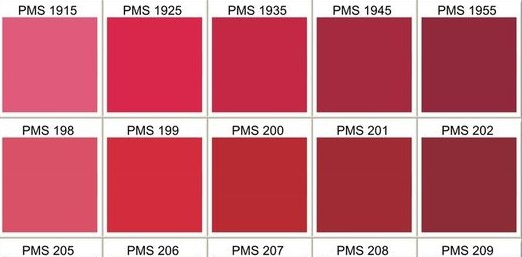
Moods: Refined, rich, elegant, mature, expensive, robust, cultivated.
Darker reds can feel earthy, established, sturdy, strong, and warm. Brighter reds feel exciting, impulsive, dramatic, aggressive, violent, powerful, courageous and stimulating.
Towards the pink end of the red spectrum, this can make financial logos appear more wild, tropical, playful, theatrical, magnetic and vibrant.
#2 Oranges & Yellows
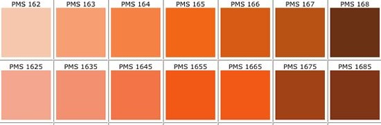
Orange moods: juicy, fruity, tangy, energising, gregarious, active, optimistic, gregarious and sociable.
Yellow moods include nourishing, hospitable, nurturing, lively, innovation, awareness and stimulation.
#3 Greens

Lime-coloured green feel acidic, youthful, citrusy and fresh. Lighter greens feel calm, soothing lightweight, neutral and quiet.
Olive greens bring up connotations such as camouflage, military and safari. Dark greens, on the other hand, feel restful, stately, traditional and reliable.
#4 Blues
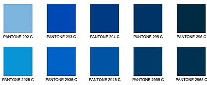
Blue is a very popular colour in the financial sector when it comes to financial logos. There’s good reason too, considering many of the powerful moods the colour variants create.
Turquoise colours create feelings of infinity, faithfulness, compassion and protection. Teal colours get more into evoking serenity, coolness, tastefulness, sophistication and confidence.
Sky blue financial logos feel cool, heavenly, reassuring, tranquil and open. Bright blues feel electric, stirring, impressive and exhilarating. Deep blues feel strong, reliable, loyal, conservative, authoritative, professional and credible.
#5 Purples
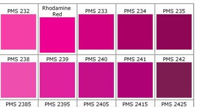
Purples can be a powerful colour for financial logos, evoking nostalgia, wistfulness and sentimentality. Other shades can elicit thoughtfulness, royalty, contemplation, mystery and intuition. Really deep purples richness, prestige and introspection.
Phil Teale is the Sales & Marketing Manager at CreativeAdviser, an agency providing bespoke website design, branding, graphic design and video production services to financial clients. Along with our sister company, MarketingAdviser, we also specialise in marketing for wealth managers and financial advisers.
Contact us on 01923 232840 or email me: [email protected]