Your logo design is incredibly important to your financial services firm.
It is the visual focal point and representation of your brand, and will likely be the image which springs to people’s minds when they think of your name or talk about your services.
Without a compelling logo design, financial firms struggle to be recognised or trusted by new prospects – even if they are incredible in delivering their services to clients. So you really do need a good one!
The challenge lies in the fact that unique, high-quality logo design is not easy – not even for graphic design professionals. Even experienced agencies can get it wrong occasionally if they’re not careful.
In this article, we’ve compiled a list of 5 common mistakes made by financial logo designers. Our hope is that this will help you to hold your design agency accountable when it comes to your own graphic design project, therefore resulting in a better final design at the end of the process.
Mistake #1: “Trend reliance”

One of the foundational principles of good logo design is “timelessness”. In other words, your logo should seek to be as compelling, attractive and relevant as possible not just today – but into the future.
Of course, fashions and tastes inevitably change so of course, there are limits here. It is highly unlikely that anyone could design a logo which would work well (completely unchanged) for centuries. Yet your logo should have a good number of years in its lifespan before you need to revisit it.
This means being careful not to focus too heavily on “current trends” in logo design within your financial services industry, or indeed, further afield. For instance, some design commentators have noted that in 2019, “metallic logos” and “multicolour gradients” are becoming more popular. There’s nothing wrong with these trends per se, but you and your designer should be careful not to focus on a logo incorporating one of these trends simply because it is currently in vogue. It might not be in 6 months!
Mistake #2: Typefaces
It might be acceptable for teachers to use Comic Sans on their PowerPoint presentation for classes. Yet when it comes to financial logo design, your use of font/typeface is really important.
The style of your logo lettering has a significant impact on your value perception. A “Times New Roman” style font might simply be too formal for your brand and target audience, whilst an “Arial” style font is likely to be too bland and “same same”.
In the same breath, does it really make sense for your designer to select an original font which is difficult for your team to access on their computers, and which is very expensive? Moreover, how many typefaces should your logo have? One might be enough for a particular brand, but for others, this might look too basic and not carry the right message across. In other cases, having multiple typefaces could appear “too busy” or muddled (if the fonts do not compliment/synergise with one another).
Then there is the issue of volume – how much text should your logo even have? Is there too much wording or perhaps too little?
There are no universal, correct answers to these questions. A fine balance often needs to be achieved by your financial logo designer, and it can take several design rounds to get it right. What works for one firm might not work for another. Yet mistakes are often made when these questions are not asked during a design project. If your designer is not highlighting them to you, make sure you do so to them!
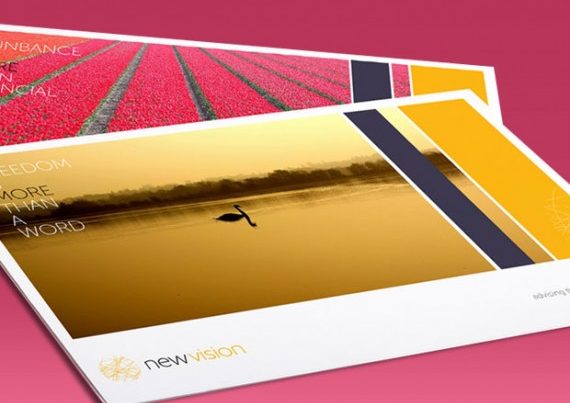
Mistake #3: Colour schemes
![]()
![]()
Certain brands might be able to thrive despite their logo design. The Google logo, for instance, is widely regarded as quite muddled in its use of colour, but the immense power of the rest of the brand allows the company to get away with it – and even make it work.
Most financial firms do not have the brand equity to pull that off, so you need to pay careful attention to the use of colour in your logo design. Remember, each colour tends to have its particular “emotions” and “mental associations” attached to it, and these can change depending on each colour’s depth, shade and combination with others.
Make sure that both you and your financial logo designer regularly ask yourselves whether or not a particular colour scheme carries the right message across for your brand. Does it make you look too friendly, or too “corporate”? Does it suggest that your company works in a particular field or industry, which is not correct (e.g. environmental protection)?
Mistake #4: Raster files
This is a less common mistake made by financial logo designers, but it can sometimes happen.
When your project is completed with your design agency, they should hand you the files for the completed logo which they created for you. There are broadly two types of file: vector and raster.
You will want the first type, as it allows your logo design to be “scaled up or down” in size without losing the image sharpness, or quality. Raster files cannot do this, however. When you try and blow a raster image up (e.g. to fit onto a pop-up banner design), it will likely distort.
Make sure you request and receive the right files at the end of your creative project.
Mistake #5: Copying
It shouldn’t happen, but it does from time to time.
Plagiarism in financial logo design could be as “small” as copying an element of an icon from another financial logo, to as “large” as copying and pasting the whole design from another company into your project – trying to pass it as something original.
This tends to occur more often with lower-quality, off-shore logo designers which financial firms sometimes approach for a “cheap”, “quick” solution. Perhaps it happens because copyright laws in other countries might be less stringent than in the UK, but it is certainly encouraged by using a “bidding” platform – where you approach several logo designers with a project and only pay the designer who came up with the “winning design”, which you selected.
Since this system only compensates each freelancer if their design is selected, it encourages people to cut corners and submit as many designs as possible to lots of different clients. Naturally, you can do this on a much higher scale if you simply copy and paste a logo from the internet onto your client’s project!
The best way to avoid this scenario is to work with an established, reputable design agency with significant experience in the financial services industry. At CreativeAdviser, our portfolio shows that we meet these criteria and can deliver to a high standard when it comes to financial logo design.
Please get in touch today, to discuss your own project with a member of our team.