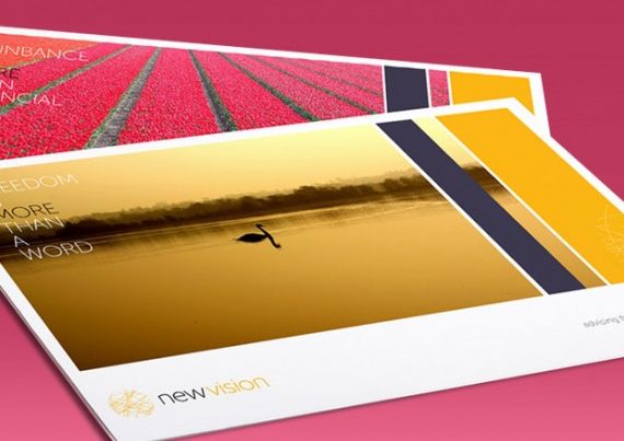
In the world of finance, a logo truly speaks a thousand words. In fact, some of the most recognisable logos actually contain no words at all (think of Prudential, for example). In fact, one of the most challenging tasks for any website owner is creating a striking, original and captivating design. This is actually much more difficult than it sounds, for there is often the quandary of it is it better to produce a logo with a long name and mission statement or if it should be kept simple and to the point. So, is a brief approach the best way to convey a meaning across to the reader? Let’s take a closer look at this critical question.
The Balance Between Simple and Confusing
To being with, most financial websites are not as well known as major multinational conglomerates that may simply rely upon simple graphical branding. For instance, let’s imagine you have a company that has recently begun operations. Would you simply brand it “E & G Financing”? While this may seem sufficient, it says very little about what the company does or the type of client that it caters to. This is especially relevant in reference to a search engine ranking page. At first glance, the visitor is likely to be unaware of what separates this company from the rest. So, what is known as a “tag line” is just as important. For example, this statement reads much better:
“E & G: Your One-Stop Shop for Forex Trading”
In other words, this title has remained simple and to the point but it still conveys to the reader what he or she may be looking for. However, there is a fine line between explanation and confusion. Let’s take this title, for instance:
“E & G: Leverage A Forex Position Utilising Our Latest Algorithms”
While the statement is actually the same as the first title, those who are unfamiliar with the Forex industry (your likely target market for new clientele) will be confused. They are likely to choose a platform that “reads” easier.
Personality
The world of finance does not have to be dull and dry. In truth, a number of sites have still not realised this immutable fact. So, it is critical that you try to employ a bit of flavour into your logo (if possible). This can be done through organic colours (green, orange and brown are ideal for this), streamlined fonts as opposed to Times New Roman and even addressing the reader as “You”. Again, the first title that we have seen is a good example of this. If a logo has the ability to identify with the guest, he or she is likely to read on and discover what you have to offer.
Ultimately, a logo should speak a thousand words by saying only a handful. This is can be a task that is difficult to accomplish but with a bit of forethought and experimenting with various fields, it is much closer of a reality than you think.


