Anyone who has worked in the financial world for a considerable amount of time understands that the term “business as usual” no longer applies when referring to branding, advertising and marketing. This is actually quite an important paradigm shift, for such principles as solidarity and a strong foundation have been eroded by some of the very same corporations that once espoused these principles (think of Northern Rock, if you will). Instead, sensations of momentum and progress now tend to dominate many financial circles; particularly when relating to their public. So the question is how a company can embrace this notion in a logo. After all, is not a logo a mere static image? In effect, there are very interesting ways that a sense of movement can be displayed even in the simplest of designs.
Font
First and foremost, it is important to realise that the font of a logo will have a remarkable impact on the “feel” that the logo imbues upon the reader. In the past, Times New Roman and Courier New fonts were prolifically utilised. In fact, such entities as The Wall Street Journal will likely keep this design. However, newer and innovative financial businesses will use more flowing and even italicised lettering. This conveys a sense of movement and adaptation; much like a reed in the wind. While the psychological impact may be subdued, it will nonetheless convey to the observer the idea of flexibility and adaptability in changing times.
Angled Imagery
A second technique that enterprises are beginning to adopt is the use of images and lettering that are angled upwards (think of a trending chart for an equity doing well). Obviously, the upward momentum should never be replaced by a downward slope for reasons that need not be stated here. The angle of a logo will create a sense of momentum when viewed; helping to establish the company as being on its way up in the world of finance.
Flowing Images
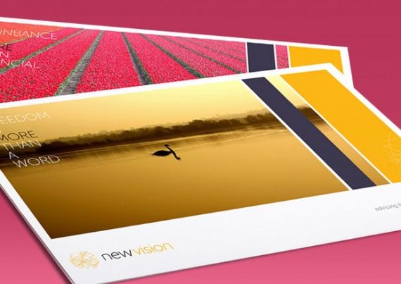
A third variable that is extremely important is for companies to employ an image that represents a sense of perpetual momentum. The Nike “swoosh” can be an example of this. In fact, this graphic has even become more famous than the word “Nike” itself in recent years; recognisable the world over. Similarly, simplified images of waves, a tree in the wind, clouds, the rays of the sun or an animal running over terrain are all excellent means that will help convey this sense of progress and forward momentum.
It should be stated that this principle is often times harder to accomplish than it may appear. It is for this reason that marketing experts will initially examine the core values and the mission statement of a company before determining what images, fonts and angles should be used (if any). Still, the perception of movement is considered to be one of the most essential variables in helping to separate a sub-par company from one that will make an impact in this year and the years to follow.