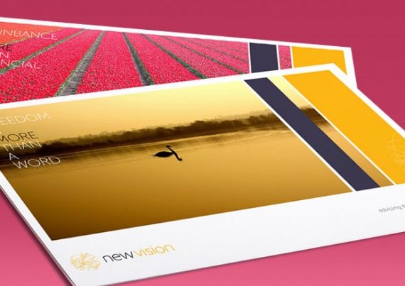
Your logo is the key component of your financial company’s branding. It needs to reflect your mission statement, core values, and build trust with your audience – all while being memorable and flexible when it comes to design.
In short, designing an effective financial logo isn’t an easy task.
Here are 5 things you should test your logo against, in order to ensure its effectiveness when it comes to your brand narrative and it’s designed.
1 – Does it identify with your audience?
When designing a logo, you should think carefully about your target audience, in particular their age and profession. The images and words used within the logo need to highlight the concepts that you think will resonate the most with your audience.
2 – Does it accurately communicate your business?
With all industries, there are certain images that communicate finance more effectively than others. Your logo should accurately portray your industry niche at a glance. If you are unsure of how to test this, the easiest thing to do is send it to a blind test and ask people what type of business the logo represents.
3 – Have you used the right colour palette?
Your logo colour palette should be directly influenced by tests one and two. When it comes to your target audience think about who you’re appealing to. Bright colours, for example, tend to appeal to much younger audiences. On the other hand, you also need to think about the right colours for your business. Red is commonly associated with risk and danger, perhaps not the message you want to communicate as a financial company.
Top Tip: Don’t forget to trail your logo in black and white – you won’t always be able to reproduce it in colour!
4 – Is your design suited for multiple formats?
At first, this point can sound obvious, but you’ll be surprised how many businesses don’t trial their logo in every format possible before going ahead. While your logo is most likely to be seen on your website, you also need to consider how it will look in a smaller format for places such as social media, email newsletters, brochures, traditional letter headers, business cards. Conversely, you may also want to consider how it will look at its largest – perhaps for billboard or window advertising.
5 – Is your logo timeless?
Over time, it is likely that your logo will need updating as times move on and your business goes through natural changes and growth. If your logo sits more on the end of timeless, rather than trendy, you’ll avoid having to make these potentially expensive changes for years to come.