
Which principles should guide a strong website design for the finance sector? How can you use them to “judge” different finance website designs – including your own – to make sure your agency does a good job?
Since website design is highly artistic, there are no universal answers. Rather, there are artistic principles that draw upon widespread experience, data-led research (i.e. into what “works” with various users) and “best practice” built up over time.
In this article, our team at CreativeAdviser will be sharing 7 principles that can be used to inform the design process when creating a finance website. We hope this is useful to you, and invite you to get in touch if you’d like to discuss your own project with us.
#1 Visual hierarchy
The human eye does not tend to look at the “whole picture” at once, when looking at a finance website homepage. Rather, it is drawn to the most prominent features first, and then works down the rest of the elements in order of decreasing prominence.
With a finance website design, certain components will naturally be more important than others. These may include calls to action (CTAs), contact forms and downloadable resources (e.g. PDF guides). As such, you want these to capture the user’s attention first.
Look at your website and ask yourself: are the key features the most immediately noticeable? Remember, this isn’t just to do with the size of the element or component. Style and colour are also crucial for drawing attention.
#2 Hick’s law
Have you ever heard of “choice paralysis”? This happens when you look at a restaurant menu and you freeze, because there are simply too many dishes to choose from! Or, perhaps you’ve looked at a voting form at a polling booth and felt overwhelmed by the candidate choices.
Similarly, a finance website design with too many menu items, buttons or links threatens to alienate the user. This increases the time and effort involved to make (what should be) simple decisions, like navigate to a page that you want.
Hick’s law guides us to keep things simple. If, for instance, you have a large library of products or articles on your website, consider offering a “filter” feature on the pages so that users can quickly narrow down their options.
#3 Rule of thirds
Those who have experience in photograph likely have heard of this one before.
Imagine that you are looking at a photograph and that you draw two vertical lines, as well as two horizonal ones (creating 9 “boxes”).
The rule of thirds states that elements with an image should be placed at the intersections of these lines, or simply along the lines.
This creates a naturally more “satisfying” sense of order to the visual and is inherently more interesting to look at. Try to avoid or minimise imagery which places the key components in the centre.
#4 Fitt’s law
Have you ever tried to use an app, such as a music player, and struggled to find the “play” button?
Or, maybe the button is in a far corner of the screen – requiring extra effort than you would like, due to the distance involved.
Here, Fitt’s law suggests that the bigger an object is and the closer it is to you, the greater the ease of use.
For instance, on a contact form, you might have two calls to action (CTAs) – “Submit” and “Reset”. Most likely, you want your users to hit the first button (and most of them probably do, too). Therefore, consider making the first bigger and easier to reach than the second.
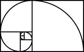
#5 Divine proportions
Those mathematical readers among us may have heard of the Golden Ratio – i.e. the number 1.618 (φ).
Artwork, photography and finance websites which follow this principle are widely deemed to be pleasing to the eye. A good example relating to this is the Fibonacci Sequence, which follows the mathematical equation: Xn+2= Xn+1 + Xn.
Below is a representation of the Golden Ratio:
You can see this in architecture, for instance, when you look at the Parthenon (ancient Greece). You can also see it in website design.
For instance, social media platforms often follow the layout above – e.g. small profile picture and biography on the left, banner at the top and news feed on the right. A finance website design which follows this sort of approach is likely standing on strong ground.
#6 Gestalt design
This is a theory grounded in psychology, and claims that humans see a “whole” object before noticing its constituent parts.
For instance, if you look at a leopard, you likely notice the entire animal before your attention starts wandering to its individual spots.
When it comes to a finance website design, therefore, users tend to look at the whole page before looking at the different prominent parts (e.g. header, footer, call to action etc.).
As such, it is important to consider the overall impact and not just focus on the design of each part or section.
To test this out, take a step back and ask yourself what kind of “first impression” your finance website makes. What would others think?
#7 White space / clean design
This is still a very popular approach to finance website design in 2022. Essentially, it keeps large portions of each web page “empty”.
This allows the design to create a “clean” effect and maximise use of principles like hierarchy. It avoids the danger of a website appearing cluttered, busy or indistinguishable. White space also gives the human brain an easier time seeing the main features and messaging.