The world of finance can be a complicated place. Phrases such as “indemnity”, “profit”, “revenue” and “pipeline” are often seen alongside even more obscure and difficult terminology. Of course this is the case, for why else would someone be choosing to visit a site for the first time? This is the primary factor that anyone must consider when designing a financially oriented website. The visitor (and hopefully the customer) needs guidance and simplicity. So, the main premise of any website needs to be based upon these two related principles. However, this is often easier said than done. Let’s look at some key ways that you can project simplicity while not diluting the services that you provide.
Phrasing
First of all, it is important to speak to the reader directly. When one feels like his or her needs are being catered to, they are naturally inclined to pay more attention. Avoid using abstract examples and instead employ statements such as “Imagine if you were…” and other proactive sentences. The more attention the visitor pays to what you have to say, the clearer your product or service will become.
Appearance
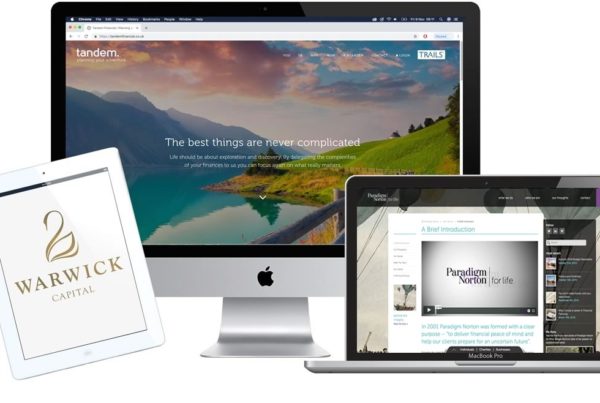
Another key area that needs to be addressed is the appearance of the site itself. If you Google “the best financial website layouts” there is one thing that you will note which they all have in common. Their homepages are uncluttered and generally quite visually appealing with a rather minimalist flavour. Why does this work so well? Again, we must return to the initial reason that someone will visit your site. The chances are high that they felt overwhelmed with their financial responsibilities. So, they are obviously looking for a virtual “breath of fresh air”. Presenting your site in a simple and relaxing way will provide you with a psychological edge over your competitors.
Navigation
Along the same lines with a simple appearance NEEDS to be a site that is easy to navigate. Of course, you can choose your layout to be slightly different based upon your needs. Remember a few fundamental points. First, people read from left to right. Therefore, it makes sense to have any menus located on the left-hand side of the screen. Secondly, we read from top to bottom. So, immediate contact information should be placed in BOTH portions. This will give the reader two chances to speak with a representative if they wish to take action. Lastly (and most critically), each page of your site should have a “main menu” option as well as the aforementioned contact details. No one wishes to scroll back and forth in search for what should be pertinent information. By presenting your portal in such a “uniform” manner, a sense of familiarity will soon develop. Once again, this can help lead to much higher conversion rates.
These steps may appear to be over-simplifying the matter of financial website design, but it should be stressed that in this case, simple is indeed better. By embracing these key points, your site will achieve the exposure that it needs while still presenting the information that you wish to get across to the prospective client.