Project goals
Improve the user journey, since the previous Boost Capital website could be difficult to use. The loan application process in particular was cumbersome to navigate, and the site structure could lead users feeling somewhat lost.
Increase engagement rates, since Boost Capital’s business model relies on successful loan applications being processed. The website would therefore need to improve online conversion rates, and demonstrate increased brand engagement.
Provide a clear website structure and set of synchronised content to allow easy integration with existing digital campaigns such as AdWords, SEO and Facebook Ads. This would need an appropriate set of landing pages, strategic content and call-to-actions.
Modernise the overall design to look fresh, prestigious and up-to-date in order to demonstrate credibility to the target audience. The design would also need to work perfectly on mobiles, tablets and across all major browsers.
The results
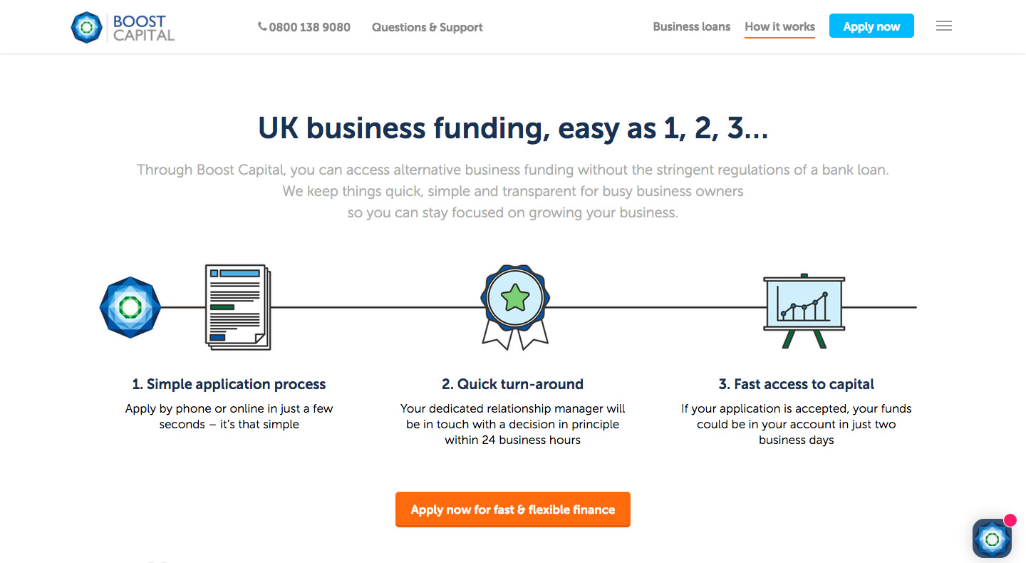
“Business funding, easy as 1, 2, 3…”
The new website created a clean, modern and innovative approach to the Boost Capital brand, providing an effective focal point for their digital marketing channels.
The new financial website performed very well from the start. Within days of the website’s launch, the conversion rate was already markedly higher compared to the previous version.
The solution was much easier for users to navigate, especially on mobile devices. This made it easier for business owners to apply for a Boost loan, and incentivised them to return to the content later – thus increasing exposure and awareness of the Boost brand.
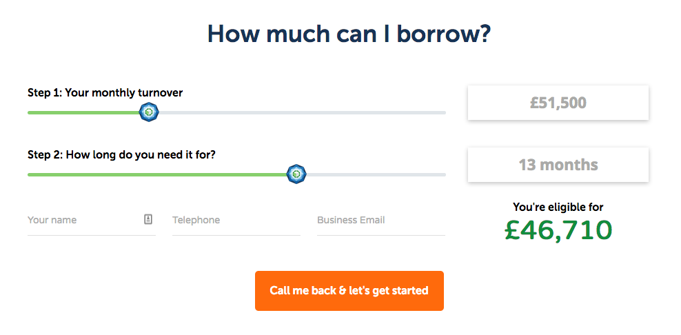
The new financial website design also enriched the user experience. The new website loads more quickly, and makes use of new interactive tools such a the loan calculator above.
The financial website also has a lot more character with the new grey, green and dark blue colour scheme. Previously, the brand colours hinged around quite a dull grey which did not inspire as much emotional engagement from the website visitor.
Finally, the new website provided a much better experience on mobile and tablet devices. This sets it up much more nicely for future search engine optimisation, regular client newsletters and ongoing digital marketing campaigns.
View Website