Think of some well-known financial brands. American Express, JP Morgan, Lloyds, St James’s Place, Brewin Dolphin and so on. What do they all share, apart from operating in the financial sector? One thing they share is a commitment to a strong financial logo and brand.
Branding plays a key role in financial services. To entrust banks, wealth managers and financial planners with their hard-earned money, clients need to feel very confident in a financial firm beforehand. A financial brand helps create a sense of trust, reliability and success which is clearly communicated in its visual identity.
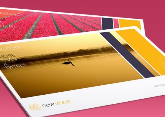
A visual identity comprises key assets like a logo design, colour scheme, imagery, styling, fonts, photography, tone of voice and straplines. Together, they work to convey the brand’s unique personality, values and target audience. Yet how does a business create a strong financial logo and brand? What are some key tips to carry into a potential project in 2023?
Pick the right colour(s)
The above financial brands largely share a love of the colour blue. This is not an accident. Scientific research shows that blue instils feelings of trust and reliability in human brains. It can also communicate stability, serenity and peacefulness. These are all helpful connotations to stir up when dealing with a target audience for a financial firm.
However, the danger of simply leaning on a popular colour is that your brand fails to stand out from the competition. Other colours can help to create a memorable visual identity whilst also generating positive feelings from your audience. Red, for instance, is used by NatWest and HSBC. This colour can represent energy, vitality, passion and speed.
A balance should also be sought by finding multiple colours for your financial brand which work well together. Simply choosing one colour, regardless of which it is, will risk looking bland – lacking in contrast and variety. By selecting two or three additional colours, however, you can create a more interesting colour palette and mitigate some of the negative emotions attached to each one.
For instance, red can convey feelings of anger or warning. Blue, conversely, risks coming across as aloof or cold. By combining them (such as Citi logo), for instance, a financial firm can limit these messages to their target audience.
Pick the right shapes & sizes
Forms (shapes) still play a key role in influencing subconscious triggers and perceptions. Knowing how these work, therefore, can help you decide on a strong logo for your financial firm. Squares, for instance, help convey a sense of stability and solidity. Triangles, conversely, help to communicate energy and innovation. Circles are useful for creating a sense of unity and protection.
Most financial firms seem to favour the rectangle, followed by the square and then the circle. Knowing this could present opportunities for differentiation with your own brand. Just be mindful that your financial logo should be identifiable at whatever size it is. Whether used on a website header or in a tiny favicon in your browser, your audience should be able to discern it easily.
Find emotional connections
Sometimes we speak to people in financial services who are uncomfortable with bringing emotions into their financial logo and brand. After all, shouldn’t a financial firm be objective and not affected by human impulses? Certainly, many banks and large institutions in the financial sector seem distant and cold. Yet that does not mean that this is the right direction to go.
Think of Lloyds and its Black Horse as an example. Inherited in the 1880s from another bank, this symbol has become a powerful tool in the bank’s marketing over its history. Recently, TV adverts have featured the horse running through fields, beaches and hills to create a sense of an “epic journey” that customers can relate to. The horse is also a powerful symbol in its own right – representing strength, courage, majesty, spirit and freedom. Watch the video on YouTube and see how it makes you feel!
The emotional experience of your financial brand, in short, is a powerful differentiator from your competition. If you can make them feel something unique, then your business is more likely to be remembered positively.
Focus on the client
Let’s take the example of Lloyds and the Black Horse one step further. Next to its logo, it often features the slogan: “By your side”. This communicates a lot in three short words. Accompanied by the image of the horse, the audience gets the sense that this represents the bank and they (the viewer) and the rider. You can ride a horse, certainly, but you can also walk alongside one. This is an intimate picture of friendship and trust; going on a journey together and sharing in bonding memories and experiences.
Not many people own horses, but lots of people can relate to the idea of having a “noble steed” which you can depend upon – especially in hard times. A powerful financial brand, in other words, does not spend its energy trying to communicate how great they are. Rather, they focus on the client – their goals, needs and dreams – and what how they can help them achieve what they want.
This helps to illustrate why many financial firms are missing a trick with their logo. Certainly, you can just run with your company name. Yet what imagery, styles and devices can you use to say something meaningful to your target client?
Here at CreativeAdviser, we thrive on creating unique, bespoke brands and logo for financial firms. Interested in starting a conversation? Get in touch to arrange a free, no-commitment consultation with a member of our team, today.