What makes a great logo for financial services? Which principles can you follow to create a design that stands the test of time?
The team with CreativeAdviser has been designing financial logos for nearly 30 years. Below, we share 8 ideas to help financial firms craft a compelling logo which fits their branding needs over the long term.
We hope you find this content helpful. Please get in touch if you’d like to discuss your own financial logo project with us.
#1 Keep it simple
Many financial firms are tempted to create an intricate, complicated financial logo in an attempt to “stand out”.
Counter-intuitively, the more complex a financial logo is, the worse it is likely to perform. This is partly because these logos can look cluttered, and also because they are harder to remember.
As a general rule, lean towards a simple financial logo which follows the “less is more” principle.
#Make it memorable
How many logos can you remember when the name of a company is mentioned to you? Chances are, not that many.
A strong financial logo should be very easy to recollect. There are many ways to do this. One idea is to use a unique illustration as an icon. This could be an unusual animal within the financial planning space (e.g. a crocodile, or giraffe), or a special symbol.
Part of the memorability of your financial logo could lie in your company’s name, itself. A great, memorable name can do a lot of the legwork for your logo, taking pressure away from needing to find a unique image to compliment the text.
#3 Be original
How many pictures of boats and sunrises feature on financial planners’ websites? Quite a lot.
These sorts of images are over-used, and the danger in following them is that your financial brand loses originality – making it harder to recognise and remember. It is worth investing in an original financial logo, therefore.
To avoid falling into industry clichés, consider doing an image search to find patterns and repetitive themes. Make a note to avoid these and to explore other ideas which convey your brand character, values and messaging.
#4 Aim for timelessness
Have you noticed how many iterations of the Starbucks, Coca Cola and Burger King logos there have been over the decades?
If you take time to research them, you’ll notice that each one retains a sense of the core image over time. However, the styling, emphasis and colours develop as attitudes and perceptions change. Financial logos should aim for something similar.
Here, good practice is to build your financial logo ideas upon sound design principles which stand the test of time. Also, try to include a high degree of “built in” flexibility so that you can adapt your logo, later, if necessary.
#5 Strike a balance
What makes a good photograph? Part of the answer lies in things such as resolution. However, balance is also vital.
For instance, photographers often follow the “rule of thirds” to make sure all constituent parts in the image hold together well, and appear pleasing to the human eye. Financial logos should also seek to convey a sense of proportion and symmetry, to satisfy the viewer.
Be careful not to violate these rules carelessly, in an effort to try and be different.
#6 Provide versatility
Modern financial logos are likely to be used in a wide range of contexts and marketing materials.
They need to be able to “fit” into these, accordingly. For example, can your logo work on a social media profile image? These are typically quite small “circles” or “windows” which may not accommodate a long, text-based financial logo.
Also, does your logo work in favicons, thumbnails and other digital “micro contexts?”
Moreover, you should be able to use it on a brochure, letterhead, compliment slip, leaflet, business card, pop up banner and all sorts of other marketing materials. Could it also feature nicely on a pen, mug or keychain?
You never know what materials your marketing strategy might call for in the future. Make sure your financial logo is prepared.
#7 Find complimentary colours
Your colour scheme is hugely important, as your audience is likely to make certain assumptions and associations based on them.
For instance, red is commonly seen as a “passionate”, “aggressive” or “energetic” colour. Black is typically regarded as the colour of “neutrality”, “mourning” and “elegance”. Many of these meanings are subjective and cross-over, but they matter.
What impression do you want your financial logo to give? What sorts of feelings do you want it to bring up in your audience? Here, make sure you not only pick a good primary colour but also strong complimentary ones.
If your colours do not work well together, your financial logo may appear to have an “internal clash” – sending out mixed messages and looking muddled. Here, a financial logo designer can be a great help to guide you through the right creative principles.
#8 Address the basics
Your financial logo is the main visual focal point for your visual identity. As such, it is the ideal place to answer some key questions.
In particular: Who are you? What do you do, and why do you do it?
It is impossible to fully convey all of your brand values, personality and messages within a single image. However, with some creativity and dedication, you can find a design which fits into these areas authentically – and even offers some answers.
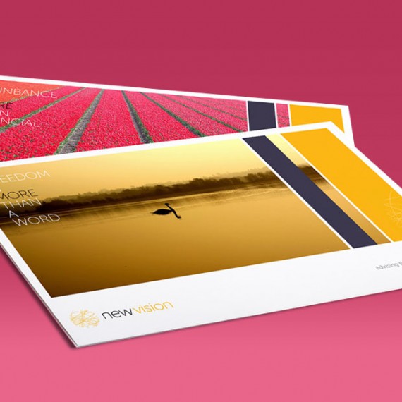
For instance, if your main business purpose is to help people “Find financial freedom through great financial planning”, how could this be represented in the financial logo design? Perhaps an animal or symbol could capture and represent this idea?