
Project goals
Refresh WMM’s visual identity to convey greater prestige and industry authority, with particular focus on the logo design and corporate colours.
To set WMM’s website on a sturdier foundation for future digital marketing campaigns an newsletter, which would need to link up to landing pages.
Design a bespoke financial website which contains all of the essential information a client or prospect might need within the homepage layout and sections.
To drive more engagement and action from website visitors, particularly in the form of contact form submissions and telephone enquiries.
Provide a more enjoyable, compelling user experience on all aspects of the website, on PCs an especially on smartphones and tablet devices.
To inspire more trust and confidence in the brand from existing clients, by housing unique, valuable content within a dedicated blog area.
The results
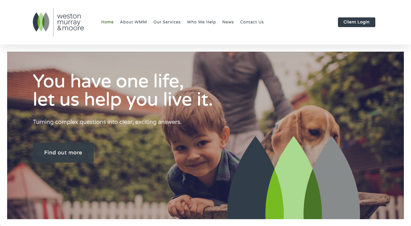
“You have one life, let us help you live it.”
Weston Murray & Moore immediately noticed a difference between their old logo and the new set of designs provided by our creative team. One frequent comment from their staff was: “Why didn’t we do this earlier?” The final logo resonated much more authentically with the character and values of the firm (e.g. providing renewal, life, energy and safety to client’s wealth).
The three leaf-shaped icons within the logo spoke naturally to their three target audiences, mentioned in the introduction above. The overall design also worked much more effectively with their other brand collateral including business cards, letterheads and social media profiles.
The new financial website design also greatly enriched the user experience. The new website loads nice and quickly, transitioning cleanly between the different sections when the user clicks on the calls to action and navigation links.
The financial website also has a lot more character with the new grey, green and dark blue colour scheme. Previously, the brand colours hinged around quite a dull grey which did not inspire as much emotional engagement from the website visitor.
Finally, the new website provided a much better experience on mobile and tablet devices. This sets it up much more nicely for future search engine optimisation, regular client newsletters and ongoing digital marketing campaigns.
View Website


